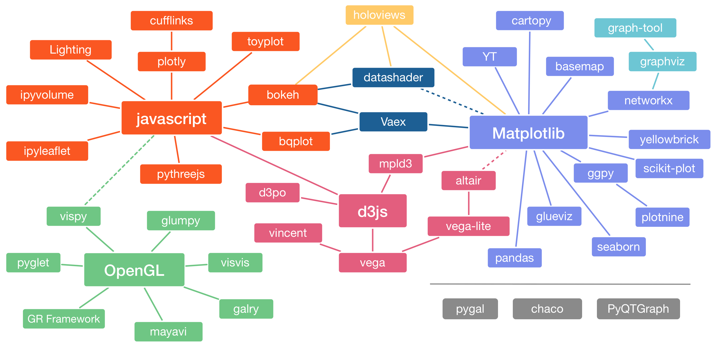
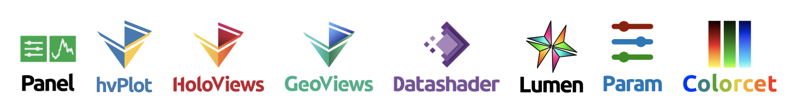
This tutorial will show you how to do visualization and build interactive dashboards using HoloViz, which is an open-source visualization ecosystem comprising eight packages. You will learn how to turn nearly any notebook into a deployable dashboard, how to build visualizations easily even for big, streaming, and multidimensional data, how to build interactive drill-down exploratory tools for your data and models without having to run a web-technology software development project, and finally how to deploy your dashboard.
We recommend running this tutorial locally on your machine. If you have trouble setting up your environment, you can run the tutorials through the Google Colab links above (click on the image).
To run this tutorial locally, you will need to do the following steps:
1. Download Anaconda or Miniconda
2. Git clone this repository and navigate to the folder
jupyter notebook or Jupyter Lab jupyterlab
If you have any questions during this tutorial, feel free to ask on our HoloViz KDD gitter. HoloViz team will be there to help you with any questions you have. After this tutorial, if you have any questions, please ask on the HoloViz discourse. If you run into an issue/bug, please submit an issue or a pull request on HoloViz Github repos. Follow HoloViz, Panel, Datashader, HoloViews on Twitter and check out awesome-panel.org for inspirations and discussions.
https://holoviz.org
https://hvplot.holoviz.org
https://datashader.org
https://panel.holoviz.org
Tutorial Easily build interactive plots and apps with hvPlot by Philipp Rudiger and Maxime Liquet
Tutorial Easy Plotting for Streaming Data by James A. Bednar
Blog post Python Dashboarding Ecosystem and Landscape: Plotly Dash, Panel, Voila, and Streamlit by Sophia Yang
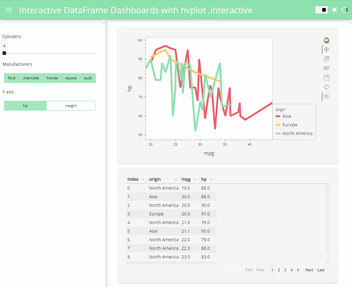
Blog post The Easiest Way to Create an Interactive Dashboard in Python Visualization: Turn Pandas pipelines into a dashboard using hvPlot .interactive
by Sophia Yang and Marc Skov Madsen
Blog post Big Data Visualization Using Datashader in Python by Sophia Yang